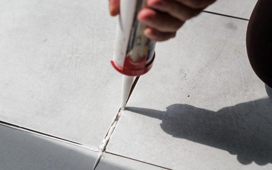
How Grout Colour Influences the Look of Tiled Spaces

Key Takeaways
- Grout colour shapes how calm, busy, or defined a tiled surface feels once installed.
- Light grout opens up small spaces, while darker tones highlight layout and pattern.
- Joint width and colour work together to change how large a surface appears.
- Planning grout colour early helps balance appearance, upkeep, and long-term wear.
Grout rarely takes attention at first glance, yet it quietly shapes how tiled areas appear and feel once you start using a space every day. You may focus on tile size, finish, or layout during selection, while grout colour often decides whether the final surface feels calm, busy, bold, or understated after installation.
When you think through grout colour early, planning decisions become clearer and visual frustration later becomes less likely. As colour, tile size, and joint spacing align, you get tiled spaces that look intentional and visually balanced instead of accidental.
Light Grout and Visual Openness
When you choose light-coloured grout, tiled areas tend to feel brighter and more open, especially in smaller rooms where visual flow affects comfort. Pale tones soften grid lines, allowing tiles to merge visually and form a continuous surface across walls or floors in kitchens, bathrooms, and compact interiors.
Lighter shades reveal dirt more quickly, so you need to factor upkeep into daily routines. Maintenance planning matters here, particularly when you select tile grouts for areas exposed to moisture, cooking residue, or frequent cleaning.
Dark Grout and Defined Patterns
Dark grout gives you definition by outlining each tile clearly and reinforcing layout structure. Strong separation draws attention to tile shape and spacing, which gives patterns more presence across floors and walls where design structure matters.
You may find that large-format tiles, geometric layouts, and feature surfaces pair well with darker joints because outlines stay visible across wider areas. When you use suitable tile grouts, deeper tones also mask staining more effectively, supporting a neater appearance in busy settings.
Matching Grout to Tile Colour
When you match grout closely to tile colour, surfaces read as smooth and uninterrupted. Fewer visual breaks allow floors and walls to feel calmer, which suits open layouts and minimalist interiors.
Designers often rely on this pairing where clean lines and visual continuity guide interior choices. You will notice this choice across many residential projects that use building materials in Singapore, where clean finishes help interiors feel organised and calm.
Using Grout to Change Perceived Space
Grout colour influences how large or compact a surface appears and shapes how a room feels during everyday use. When you pair light grout with larger tiles, floors can appear wider, while darker grout combined with smaller tiles creates a more active visual rhythm.
Joint width also shapes visual impact across a surface. If you use narrow joints with subtle tones, flow feels smoother, while wider joints with stronger contrast draw attention to spacing. Choosing tile grouts with even pigmentation helps you keep outcomes consistent once installation ends.
Practical Considerations Beyond Appearance
Your grout colour choice affects maintenance needs and long-term ageing across tiled areas. Light shades highlight staining earlier, while darker tones may show uneven fading if surrounding conditions remain unsuitable.
Environmental conditions deserve attention during planning. Humidity and temperature changes affect curing and colour stability, which remains a key consideration when working with building materials in Singapore due to year-round climate conditions.
Grout Colour in High-Traffic Areas
Entryways, corridors, and commercial environments experience continuous foot movement throughout the day. When you look at these spaces, grout faces abrasion and frequent cleaning, which alters appearance over time and affects colour consistency.
Mid-tone grout colours give you a balance between definition and upkeep across heavily used surfaces. Selecting suitable tile grouts for high-use zones helps you manage wear while keeping joints visually controlled.
Coordinating Grout With Overall Design
Grout works best when it supports the wider design scheme instead of competing with surrounding finishes. Wall colour, lighting conditions, and surface texture all influence how grout colour appears once you see it in place.
Testing samples under real lighting conditions reduces surprises after installation. Many suppliers of building materials in Singapore suggest mock-ups so you can see how selections respond under real site conditions rather than showroom lighting.
Planning Ahead for Long-Term Appearance
Grout colour decisions stay visible for as long as tiles remain in place. When you rush choices, visual fatigue or added maintenance demands may surface later. By considering usage patterns, cleaning routines, and exposure early, you align appearance with function. Early planning helps you limit changes once installation finishes.
Making Informed Choices With Confidence
Grout colour influences how tiled spaces appear, perform, and age across time. Thoughtful selection helps you maintain visual consistency while fitting everyday use. Contact ARDEX-QUICSEAL today to discuss grout options, application considerations, and material choices suited to residential and commercial tiled spaces.

